

Posted on 6 May 2020 by Juan Ocampo and Santiago Botía
The views expressed in this publication are those of the authors and do not necessarily represent those of the Agenda 2030 Graduate School or Lund University. The present document is being issued without formal editing.
Entry 1
This post is part of the series Times of crisis and is composed by collaborative posts, informative videos and a discussion episode. Each content can be read or watched independently, which means they don´t follow a specific narrative thread or are prerequisites for understanding the whole series. However, if it catches your interest we recommend you to read and watch them all to get a more holistic perspective of a creative, but researched based, exercise. If you find it interesting you are welcome to watch the complete product and please comment or reach out.
You can find the complete episode of the series here, and Santiago’s presentation on the content here. Feel free to comment and reach out. The code for some of the graphs can be found in Santiago’s Github.
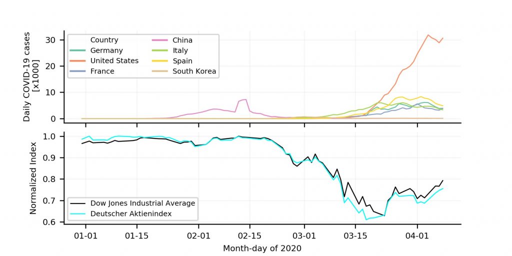
What a better start than by looking at what has become a “habit” for many of us during the COVID-19 crisis, looking at time series graphs of COVID-19 cases and the stock market behaviour. The exponential surge in detected cases and the effect the stock market has experienced is shown in Figure 1. The upper graph exposes a high and imminent threat to our health, while that in the bottom impacts our pockets. These two cases show just a few amongst many of the different consequences of the COVID-19 crisis. This collaboration started as a reaction to the global situation and the role that scholars could have in these times, regardless of their/our-own disciplines.
Two of the authors of this blog post come from Colombia, a country with many social and economic struggles that has been placed under more stress during this pandemic. In some way we felt challenged by being far from our country and not being able to contribute, in some way, to the discussion that was being held. We then decided to do what we are good at: research.
Reflecting on how the spread of the COVID-19 could affect our country we ended in a discussion on how, if even possible, to compare the economy and health. Neither of us are economists or health specialists, so it was not clear where to start. As we both have engineering backgrounds, we decide to rely on what society expects us to be good at: numbers. We started by exploring some economic indicators of countries we thought could be interesting. These were: Italy, which at that time was at its peak of COVID-19 cases; Germany as a North-European example; Canada as a least studied example in North America; Ecuador which is going through an indescribable health management challenge, and, of course, our country Colombia.
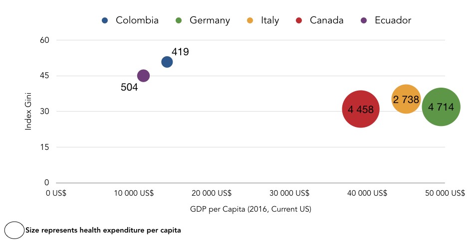
In Figure 2, it is possible to observe some interesting points in regard to the economic context of countries. The above figure shows the Gini index as an indicator for inequality, the GDP per capita reflects the wealth of the country, and finally the health expenditure per capita allows for a comparison in regards to health and economic context. Note that the poorest countries have a higher inequality and less health expenditure per capita, while countries with a lower Gini index showed both a greater GDP and health expenditure per capita.
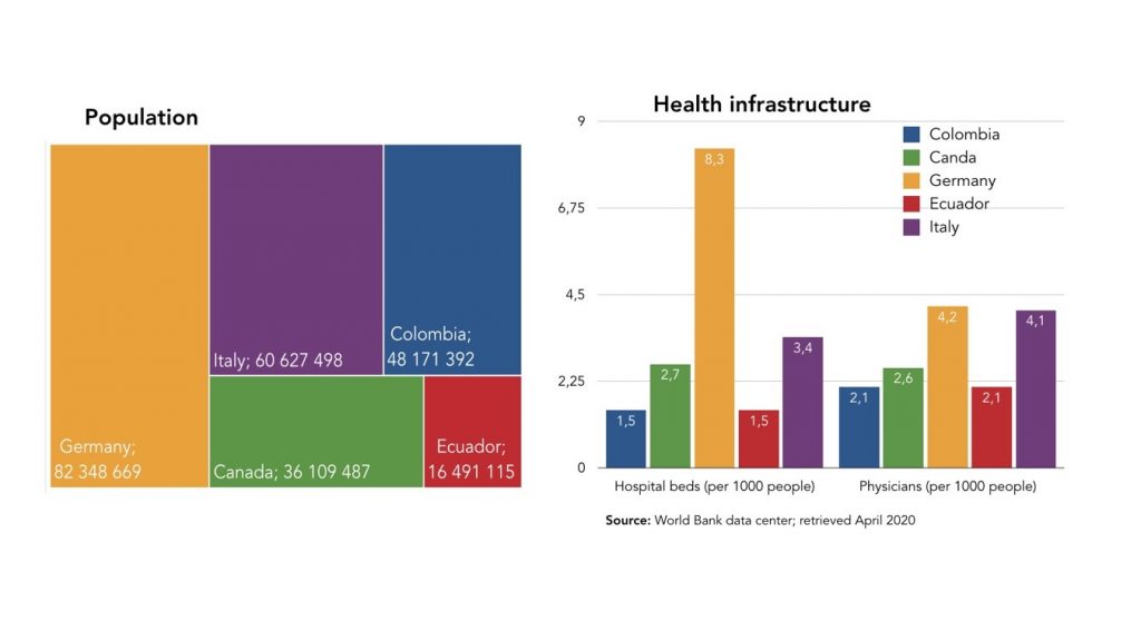
With an economic baseline drawn, it was now important to look at these countries from a health perspective. Again, drowned in data, websites, and sources we decided to observe some indicators that could give a reference of how “prepared” the selected countries were to respond to the COVID-19 health emergency. Figure 3 exposes the population of the countries and what we labelled health infrastructure, which includes the indicators found in the World Bank data bank and that measure physicians and beds per 1000 inhabitants. From these figures it is possible to observe how a country like Colombia with a population of almost 50M habitants, has less health infrastructure than a country like Canada that is around 35M habitants. Having high population a low health infrastructure is definitely something to consider in this times of crisis where countries that fail to flatten the COVID-19 curve, will see their health infrastructure suffer.
Take a look at the graphs, what do these tell you? If you are thinking about inequality, we agree with you! Even though discussing inequality tempted our spirits, we thought this issue required a whole project by itself. Even though these figures shed some light on the importance of “Leaving no one behind” in times of crisis, unfortunately, these figures didn’t help us much in our economic vs health impact discussion. We needed to reframe our question.
Seeking a new approach, we decided to start again from the beginning: Colombia. First we thought about comparing the deaths of COVID-19 with the thousands of lives Colombians have lost in a conflict with no apparent expiration date, regardless of a recent peace treaty; important but perhaps out of the scope. We then decided to make use of our deduction logic. Stopping the economy and isolating the population had a tremendous effect on everyone’s pocket but more importantly on the low-income population. Colombia had a unemployment rate of ≈9% by 2018, which is not a very good start, but another interesting/worrying fact is that 60% of the Colombian labour population depends on informal employment (≈60% for 2018). Informal employment in developing countries means that people are living on wages that depend on their daily work. Therefore, the isolation measures that the government was pressured to implement/set could lead to a further increase in the unemployment rate. But, is there a clear link between unemployment and health? No, at least it is not crystal clear for us amateurs in the field. We then tried to identify a unit for comparison, and as soulless as numbers tend to be, death became a point of reference. Here we spotted a possible missing link: high unemployment lowers income, which then reduces food access and as a consequence, increases hunger and undernourishment. Seemed reasonable, but how could we test this? Again data.
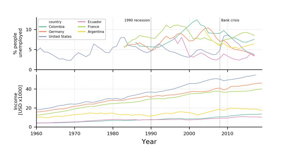
Santiago´s work is based on analysing huge chunks of atmospheric data coming from the ATTO project, and thus his skill in handling databases and developing analytical visualisations came in handy. As economists have suggested and as suggested in Figure 1, the COVID-19 pandemic is triggering an economic crisis. Thus, as a reference observing how unemployment and income have behaved during times of crisis could be useful to fathom what could come in the foreseeable future (i.e. 1990 recession and 2008 financial crisis). If you look at both graphs, during these previous crises there was a (slight) decrease in income and a clear increase in unemployment. However, keep in mind that this is an “informed” thought experiment rather than a conclusive research, but we have some confidence when we assume that unemployment affects the income of the people. Wouldn’t you think so?
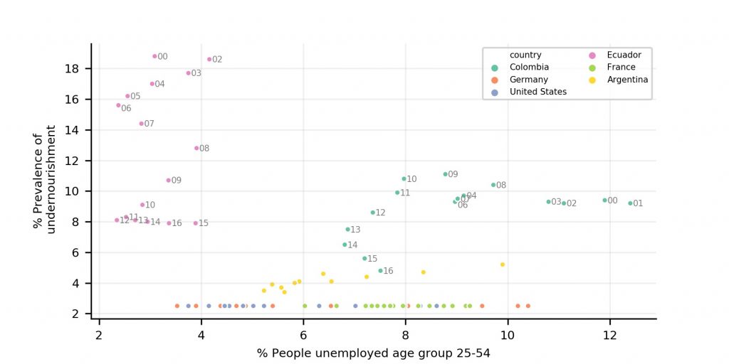
To complete our second economic argument, and aware of the limitations of looking at correlations, we decided to look to what extent unemployment and undernourishment are related. Making any conclusion was more difficult since a relationship between these two variables, we believe, is not linear and depends on the context. In addition, as Figure 4 shows, trends have changed over time. Anyway, we got some interesting observations. First unemployment seems to be completely decoupled from undernourishment in developed countries. Even at unemployment rates, of about 10% Germany managed to keep undernourishment very low. This could be explained by their public policies or just by a lack of data reliability (even though this comes from the world bank databank). For Colombia in the early 2000s the country managed to decrease unemployment rates with little impact on undernourishment. However, from 2010 to 2014, unemployment decreased together with undernourishment and for the last years of record an increase in unemployment did not show impact on undernourishment. For Ecuador, we see some interesting patterns. The country has decreased undernourishment since the beginning of the century, maintaining, in general, a low percentage of unemployment. But there have been periods in which both variables have decreased together like from 2002 to 2006 and from 2008 to 2012. Recently, unemployment rates have increased with almost no impact on undernourishment. However, the data is rather inconclusive and we leave it to our readers to develop their own conclusions.
The definition of prevalence of undernourishment can be found here.
Bear with us in our soulless analysis, since it was a thorny analytical path. The COVID-19 is an event that has no precedence and we are all constantly trying to make sense of this. In this entry we tried to make sense of our Colombian background and make use of data to shed some light on what many countries like ours are experiencing. Thinking about health and economy in terms of death, is just a reflection of how soulless data can be.